#FlorisDesign: 5 Top Tips for Cover Design
by Floris Books • 13 October 2015 • Children's Books, Design and Illustration, Floris Design, Kelpies • 0 Comments

The Kelpies Design & Illustration Prize 2016 has officially opened and the judges are eagerly awaiting this year’s entries!
In 2014, we launched the Prize with the aim of discovering new children’s design talent in Scotland. Since then, two books from our Kelpies range have had fantastic make-overs. The Sign of the Black Dagger by award-winning author Joan Lingard was the subject of the 2014 brief, and 2015 saw The Hill of the Red Fox by the highly-regarded Allan Campbell McLean getting the Kelpies Design & Illustration Prize treatment!

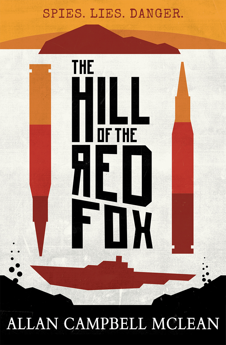
Astrid Jaekell won the 2014 prize with her design for The Sign of the Black Dagger and Lewis Copland was the 2015 winner with his cover for The Hill of the Red
But what do you do if you’ve never considered book cover design and you want to enter this year’s prize? Have no fear! Floris Design will help you on your way with our 5 top tips for cover design!
Top Tip #1: Think about the reader
A cover, no matter which book it adorns, exists to a) inform people about the book and b) attract potential readers. In order to entice these potential readers, we need to create a cover that will catch the eye of the target audience. To do this, ask yourself questions like: ‘What do they like?’, ‘What other books are they reading?’ and ‘What trends are popular at the moment?’.
This year’s Kelpies Design & Illustration Prize book, Slugboy Saves the World, is about Murdo, an unlucky 11-year-old boy who has ended up with really lame superhero powers. Looking at similar books that potential readers of Slugboy appear to enjoy is a good way to get an idea of what your cover design could look like.
Here are some examples of the competition covers for Slugboy Saves the World:
Top Tip #2: Less is more
A book cover is only a small space but a novel contains a lot of detail; don’t try to fit all of that detail onto the cover. Instead, choose your type and images carefully so they work hard together to express the overall feel of the story.
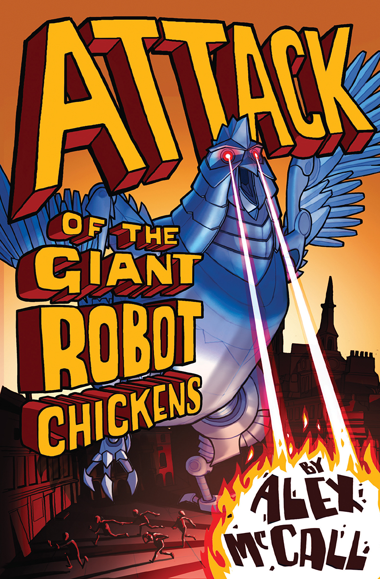
The cover of Attack of the Giant Robot Chickens, illustrated by Luke Newell, uses bold type and a punchy illustration to create the dramatic, slightly apocalyptic yet hilarious cover that portrays the feeling of the book perfectly.
Top Tip #3: Work hard to create a strong concept
Clever cover concepts are what make great covers, so spend time experimenting with different ways in which to express your idea in one image. Experiment with things like whether to use image and type, type on its own or even using image as type, and how to exploit these elements to best communicate the feel of the book.
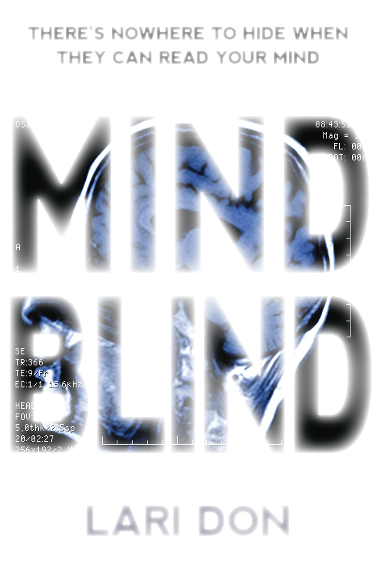
Mind Blind by Lari Don is about a group of gangsters who can read minds. The cover concept of type that shows glimpses of an MRI scan of a human head simply but effectively conveys the mind-reading aspect of the story.
Top Tip #4 Pay attention to the typography
Even if your cover concept will rely most heavily on images, do not treat typography as an afterthought. The font you use, the colour and size of the text, its placement on the cover; all these things will have a big impact on all of the other elements that appear on your cover, and therefore the overall impact of your design.
Find book covers you like and look closely at the type. How did the designer make it work with rest of the cover? Learn from looking at things you like.
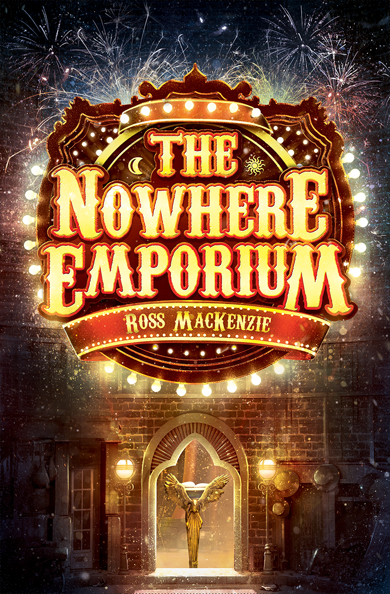
The cover of The Nowhere Emporium, illustrated by Manuel Ŝumberac, includes typography that works hard alongside the illustration to enhance the feeling of magic and extravagance.
Top Tip #5 Enjoy it!
As a cover designer, you are creating the ‘face’ of a book; that is no mean feat! But creating one image that sums up thousands of words is a brilliant exercise in design. It’s a very intense lesson in the use of colour, space, composition and type in a really succinct and economical way. So enjoy the learning curve!
Now that you’re all fired up and ready to design, enter our Kelpies Design & Illustration Prize 2016! You could win a cash prize and see your design published in October 2016! You can find all the information you need to enter on our Kelpies Design & Illustration Prize page