The Floris Books approach to children’s cover design
by Floris Books • 15 October 2014 • Children's Books, Design and Illustration, Floris Design • 0 Comments

The Kelpies Design & Illustration Prize 2015 has officially opened and everyone at Floris is patiently waiting for this year’s entries to start rolling in.
In 2014, we launched the Prize with the aim of discovering new children’s design talent in Scotland. We thought that The Sign of the Black Dagger by award-winning author Joan Lingard would be the perfect book for entrants to design a cover for. The book is now part of Floris Books’ Kelpies imprint, which publishes Scottish novels for 8-12 year-olds, hence the Kelpies Design & Illustration Prize!
Starting a new prize is a big challenge, but we were thrilled to receive so many brilliant entries and positive comments from entrants who thought that the Prize was a fantastic opportunity for budding book cover designers and illustrators to see their work in print.
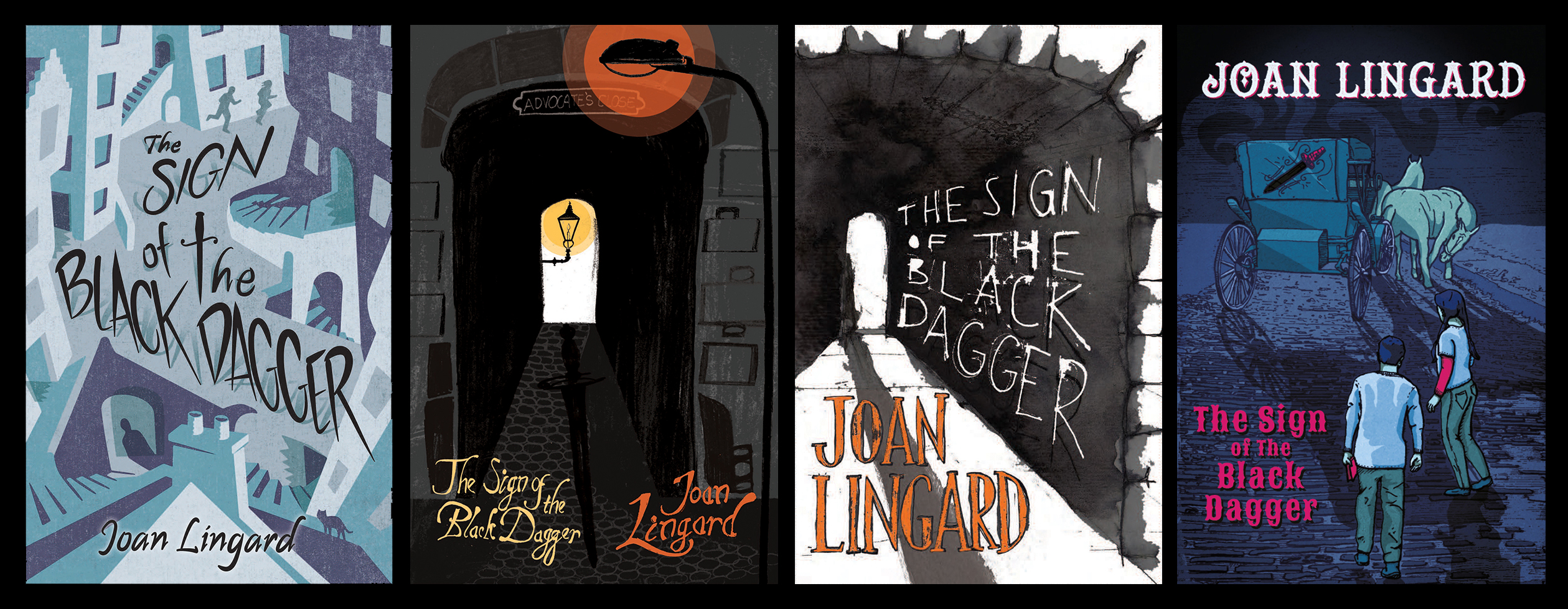
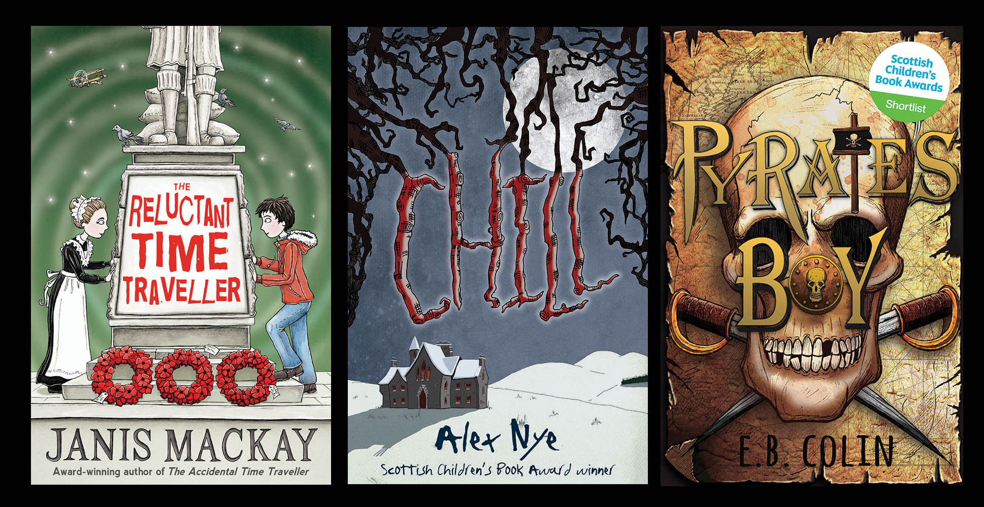
These are just a few of the excellent shortlisted designs from the inaugural Prize.
But what do you do if you’ve never considered designing a book before and you want to enter? To get you started, we thought we’d give you a little insight into the Floris approach to designing a children’s book cover. Whether you’re getting ready to enter our 2015 Prize or you’re just interested in how we do it, we hope you’ll learn something new!
The purpose of a book cover
A cover, no matter which book it is wrapped around, is there to attract potential readers and inform them about the book. We give our Kelpies covers a long to-do list: they need to clearly display the title and author of the book, to give an accurate feel for what the story is about, and to attract the attention of the right people. That’s a lot for any one cover to do!
What does the reader want?
So we know now that a book cover exists solely for the potential reader. In that case, we have to design the cover with that potential reader at the very forefront of our minds. We need to ask questions like: ‘What do they like?’, ‘What other books are they reading?’ and ‘What trends are popular at the moment?’
The key is to understand what sort of book cover attracts your reader and by asking these sorts of questions, you should begin to understand this.
Our brilliant Kelpies covers come from this sound understanding of the market (ie. what other covers are being created for similar books and readers) paired with the determination to make ours look better than all the rest!
These are some of the competition covers for this year’s Kelpies Design & Illustration Prize book; ‘Hill of the Red Fox’
Choosing a style
If you walk into your local bookshop and look at the children’s book section, you’ll see lots of different styles of book covers. Some are photographic, some rely completely on typography and others are illustrated. Which style you choose depends on the age range of your book’s potential reader. Our Kelpies are suitable for 8-12 year-olds, so our covers tend to be illustrated as most younger children’s books are. Illustration allows for a lot of flexibility: from sketches to full colour images, from cartoony to graphic in approach.
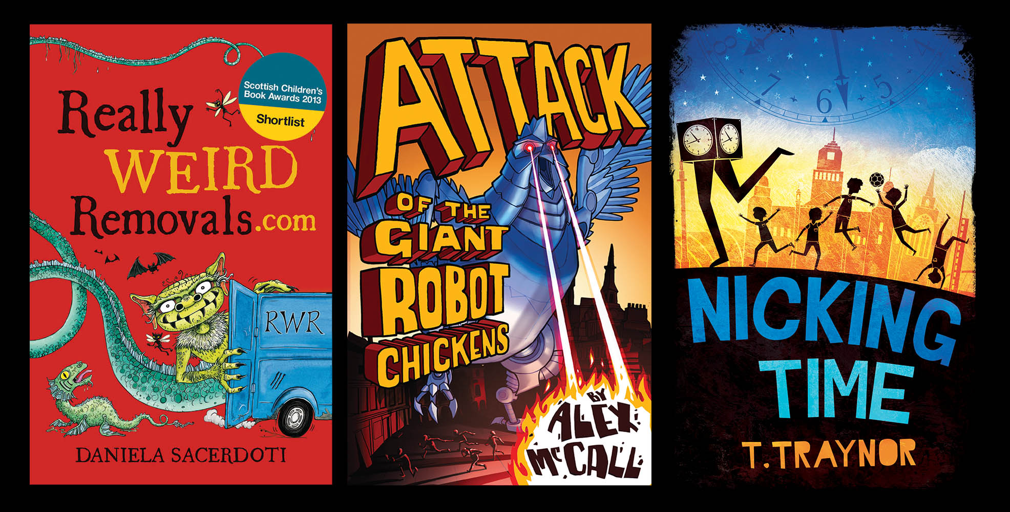
Illustration can have a lot of impact by using bold lines and bright, attractive colours.
For older readers, both teen and adult covers use a photographic or typographical style; this approach suits older themes and can be used to produce a more serious or sophisticated cover.
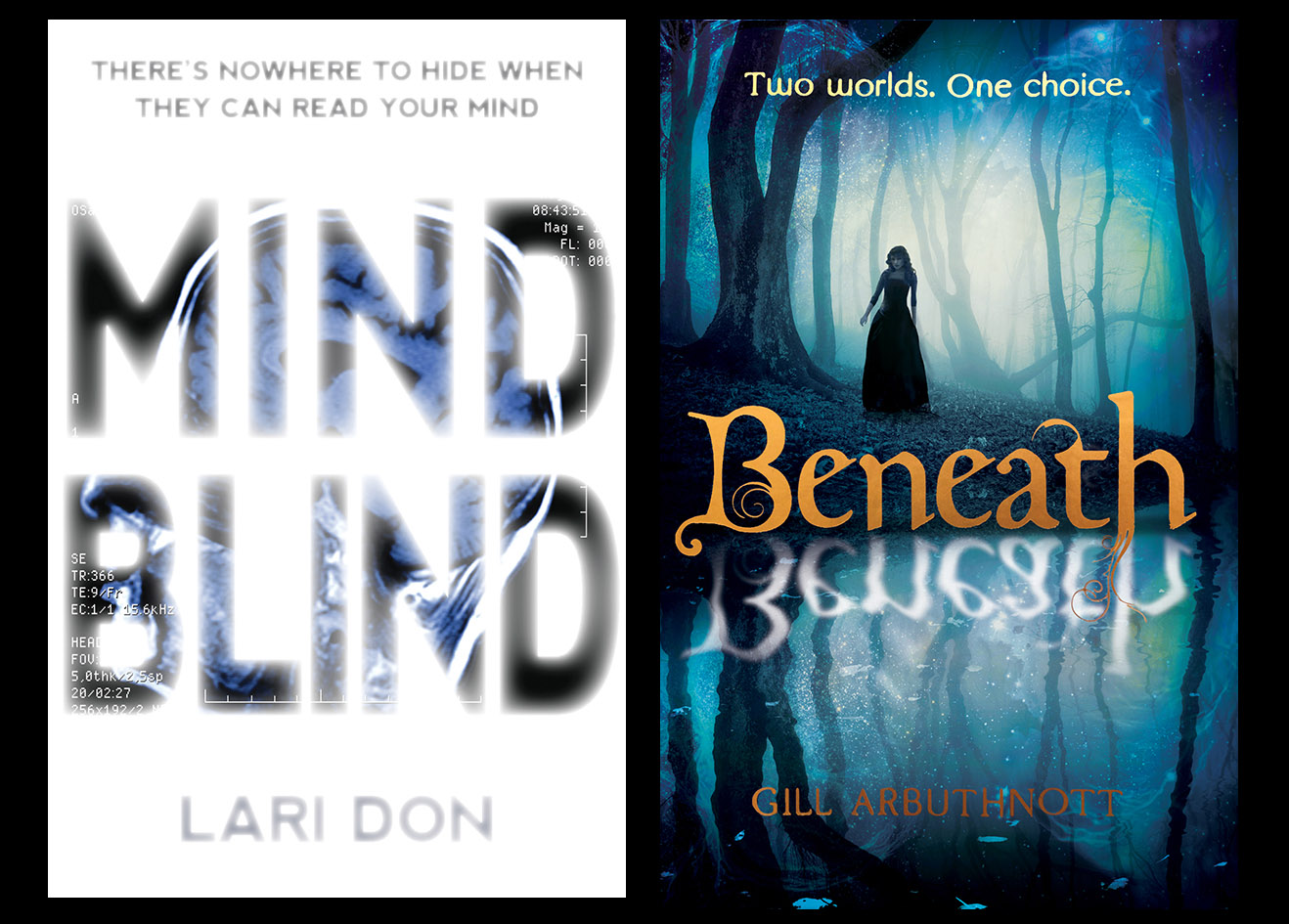
Our KelpiesTeen covers for young teens often take a photographic or typographic approach.
Keeping it brief
A common mistake is to try to squeeze the whole story onto a book cover, illustrating a complete scene or every single important element that appears in the book. This isn’t necessary: a cover only needs to give the reader a sense of what the book is about and that can be done very simply.
These covers give a good sense of the stories they represent, but do it in a bold and simple way.
It’s a lot to think about, but if you combine all of this knowledge and mix it up with some inspiration and hard work then you’ll produce a book cover that will have readers excited and impatient to read your book!
Here’s our top tips for designing a children’s book cover:
1. Think about your reader.
2. Research the market: ensure you know the competition that your book will be going up against and see which ones are selling well. This will give you some information about how certain covers are enticing their audiences.
3. Don’t underestimate the typography: it is easy to rely too heavily on an illustration and then treat the text as an afterthought. This is a cardinal sin of cover design! The text and image should work together as a whole complementing and supporting one another.
4. Enjoy yourself! The challenge of taking an entire story and illustrating it using text and image in one small space can be a difficult one, but it’s also a really interesting and enjoyable process so embrace it wholeheartedly!
If you’re all fired up and ready to design, then why not enter our Kelpies Design & Illustration Prize 2015? You could win a cash prize and see your design published in Spring 2015! You can find all the information you need to enter here.